On 17 July 2022, Hyun Song Shin, Economic Adviser and Head of Research of the BIS, gave a speech at the G20 High-level Seminar “Monetary and financial sector policy to support stability and recovery”. For near-term macroeconomic stabilisation of the economy, we are accustomed to viewing the economy mainly through the demand side, with supply adjusting smoothly in the background. However, a more balanced approach between demand and supply is essential in addressing the current inflation challenge. Today, I use this perspective to assess the odds of a soft landing for the global economy by drawing on a BIS Bulletin released this week.
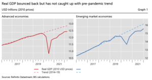
Graph 1 is a dramatic illustration of the importance of the supply side of the economy in explaining the current inflationary episode. Despite a strong recovery from the pandemic-induced downturn, real GDP is still below its pre-pandemic trend. This is true both in developed economies (Graph 1, left-hand panel) and in emerging market economies (EMEs; right-hand panel). In fact, EMEs experienced a renewed GDP growth slowdown already in mid-2021.
The charts in Graph 1 reinforce the message that the recent surge in inflation is not simply a story of excess demand that overwhelmed the pre-pandemic trend supply of the economy. Rather, it is a case of diminished supply capacity that has not kept pace with the recovery to trend. The charts in Graph 1 also reflect the role played by the additional supply shocks to energy and food following Russia’s invasion of Ukraine, as well as the impact of the Omicron wave of Covid-19. Supply bottlenecks and associated “bullwhip effects” are now showing signs of easing. However, to gauge the likely response of the global economy to monetary tightening, and to assess the likelihood of a “soft landing”, we need to cast the net wider and bring into view the broader structural elements of the economy, including the labour market.
At our last G20 seminar in December 2021, I laid out the importance of the supply side of the economy, and labour markets in particular, in determining the course of inflation developments: Supply bottlenecks have grabbed all the headlines recently, but the theme chosen by the Indonesian G20 Presidency (“Recover together, recover stronger”) also prompts us to consider the longer-term structural changes brought about by the pandemic and the policy measures deployed in response. This is particularly apt now, as we look ahead to future inflation developments. I will argue that longer-term structural issues, especially in the labour market, are crucially important in plotting the course ahead.
Since I delivered those words, the importance of the labour market in the recent inflation surge has become even more apparent. Labour markets are tight in major economies according to some indicators. Unemployment rates are at or below pre-Covid rates, and vacancy rates are unusually high relative to past recoveries. But not all indicators are fully back to pre-Covid levels. The special nature of the current surge in inflation can be seen through the lens of the Beveridge curve, which shows the relationship between the unemployment rate and job vacancies.
Normally, changes in economic activity would show up as movements along the Beveridge curve, with stronger labour demand going hand in hand with lower unemployment and higher job vacancies during periods of strong economic activity. However, in the United States the Beveridge curve has shifted out since the start of the pandemic (Graph 2, left-hand panel). This means that many more job openings are on offer than previously for the same level of unemployment. The UK Beveridge curve has also drifted out in recent months, resembling the drifting out of the US curve (right-hand panel). To be sure, the Beveridge curve has not shifted everywhere. In Japan and the euro area, there is no evidence of a rightward shift.
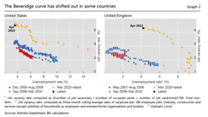
The conventional interpretation of the rightward shift in the Beveridge curve is a labour market mismatch between jobs and skills – exemplified by the reallocation of workers from the real estate sector after the Great Financial Crisis. However, this conventional explanation does not fit with the fact that job vacancies have risen most in service sectors that saw the largest job losses during the pandemic. So, a simple sectoral reallocation story seems inadequate. Instead, it may be more accurate to view the shift in the Beveridge curve as a broad-based adverse supply shock to the labour market, indicating a general decline in the supply of labour. Getting to the bottom of these labour market developments is an important task for policymakers.
Perhaps one way to approach this question is to start from the premise that firms and workers are part of the intricate web of relationships in the economy with relationship-specific capital that acts as the “glue” for the economy as a whole. Barry Eichengreen has written eloquently on this issue.4 The ties that bind all of us as colleagues, neighbours, workers and employers arguably go beyond the transactional nature of the weekly payslip. Once these relationships are broken, attempts to put the pieces back together will not be able to draw on the same reservoir of relationship-specific capital that was in place previously. The cross-country differences in the Beveridge curve indicate underlying differences in labour market participation decisions that have been affected by the pandemic (for instance, differences in job retention schemes) and possible shifts in general attitudes towards work itself.
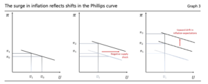
For all these reasons, the record high vacancy rates and tight labour market conditions are best viewed as reflecting an adverse supply shock in labour markets, not just strong demand. A useful analytical prop is the Phillips curve, which maps out the downward-sloping empirical relationship between inflation and unemployment. The left-hand panel of Graph 3 illustrates a modest increase in inflation associated with a decline in unemployment, in the absence of any supply disturbances to the economy. However, if the decline in unemployment is also accompanied by an adverse supply shock due to supply bottlenecks and diminished worker participation, the inflation rate associated with the lower unemployment rate may be higher due to a rightward shift in the Phillips curve, as shown in the centre panel of Graph 3.
One consequence of the rightward shift is that a previously non-inflationary (or modestly inflationary) level of unemployment would be associated with a high level of inflation. If the higher level of inflation is left to persist, we may even have an upward drift in short-term inflation expectations, and an upward drift in the Phillips curve in the manner described in Milton Friedman’s 1967 AEA address. 5 The longer inflation is left untamed, the more backward-looking inflation expectations may become, serving to bake in the higher inflation (Graph 3, right-hand panel).
To bring inflation down, the task is to bring demand back into line with supply. As we laid out in this year’s BIS Annual Economic Report, 6 central banks need to bring policy rates to more appropriate levels, and do so quickly and decisively to prevent the shift in regime from a low-inflation to a high-inflation regime. Looking ahead, the key question is whether central banks can achieve a soft landing by bringing inflation down without precipitating a recession. The answer to this question depends on how sensitive inflation is to slack in the economy, and how rapidly inflation expectations respond to a cooling of demand.
Evidence from past tightening cycles helps us further assess the risk of a hard landing. Here, I will draw on the BIS Bulletin issued this week. The left-hand panel of Graph 4 (the “spider chart”) illustrates an analysis based on 70 tightening episodes for 19 advanced economies (AEs) and six EMEs over 1980–2018, where “tightening episodes” are defined as periods of a rising nominal policy rate for at least three consecutive quarters and ending when the policy rate peaks.
The spider chart in the left-hand panel of Graph 4 compares the initial circumstances that led to instances of hard and soft landings. In this comparison, a hard landing is defined as an episode when the tightening resulted in a recession (two consecutive quarters of negative GDP growth) within three years after the interest rate peak; otherwise, the episode is classified as a soft landing. The grid in the spider chart refers to the percentiles of the variable’s country-specific historical distribution. The black dots show where we are currently, defined as the median across countries for the latest data point available.
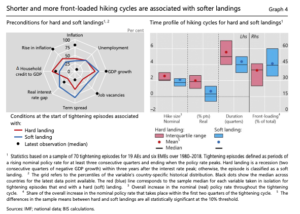
The tips of the red polygon in the spider chart correspond to the sample median for each variable (taken component by component) for tightening episodes that end up as a hard landing. Analogously, the tips of the blue polygon correspond to the sample median for each variable (taken component by component) for tightening episodes that end up with a soft landing. When we compare today’s circumstances with the red and blue polygons, we find a mixed scorecard on the possibility of a soft landing. On the one hand, past tightening cycles that started with high GDP growth and high job vacancies – typical of current conditions in many economies – have generally been followed by soft landings. However, there are other indicators today that are more consistent with a hard landing, such as a rapidly increasing inflation rate, a low term spread and a rapidly increasing household debt-to-GDP ratio.
The trajectory of the policy rate also matters for whether we will have a soft or hard landing. This is shown in the box chart in the right-hand panel of Graph 4, which compares instances of hard and soft landings in terms of the trajectory of nominal rate increases. We can draw several lessons from past hiking cycles. We see that larger increases in policy rates over a longer period were generally associated with a greater incidence of hard landings. The first two columns show the overall increase in the policy rate throughout the tightening cycle, both in nominal and in real terms.
Unsurprisingly, larger increases in the policy rate were associated with a greater incidence of hard landings. The rest of the box chart shows the consequences of how front-loaded the rate increases are, where “front-loading” is defined as the share of the overall increase in the nominal policy rate that takes place within the first two quarters of the tightening cycle. We see that front-loaded rate increases were more likely to result in a soft landing than back-loaded rate increases.
Where does all this leave us at the current juncture? Currently, there are two factors that may lift the odds of a soft landing. For one, the rotation in demand towards interest-sensitive sectors, such as durable goods and housing, may have increased the responsiveness of aggregate demand to monetary policy. Secondly, with record high vacancy rates and subdued participation rates in some countries, a tightening could trim excess labour demand without major contractions in employment.
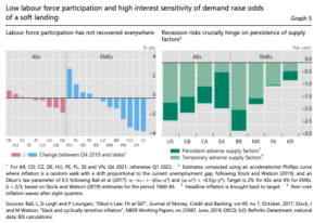
In terms of the previous Phillips curve analysis , the greater interest sensitivity of demand translates to a steeper Phillips curve, so that a moderate tightening can trim inflation where needed, avoiding unnecessary reactions in the broad swathe of economic sectors. Assuming inflation is fairly sensitive to slack (calibrated to the high-inflation period in the 1970s), expectations are backward-looking and supply factors persist, output gaps would need to shrink by 1.6 to 2.3 percentage points for two years in AEs, depending on the country, to bring headline inflation to targets.
Furthermore, to the extent that non-core inflation would wane over time, as food and energy prices stabilise, bringing inflation back to target would imply a significantly smaller contraction (0.4 to 1.6 percentage points). This would be the most optimistic scenario. However, recession risks across countries will depend crucially on the slope of the Phillips curve. The right-hand panel of Graph 5 shows illustrative calculations on the output costs of bringing inflation down. However, while the high interest sensitivity of housing demand is helpful in bringing down inflation, it could prove to be a double-edged sword in that the impact goes through the financial system.
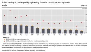
As financial conditions tighten with rising policy rates, high debt levels will undoubtedly amplify the reaction of financial markets to a monetary policy tightening. Household debt service ratios are very high currently, reflecting the long period of loose financial conditions that have prevailed in recent decades. While the countries that found themselves in the eye of the storm during the Great Financial Crisis reduced the level of household debt, those economies that suffered less during the crisis saw their household debt levels continue to rise. For this reason, the debt service ratios of households are at historical highs in many economies, as seen in Graph 6.
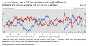
Global financial conditions have already tightened significantly, while monetary policy normalisation is still in progress. EMEs face additional challenges from a stronger dollar and associated financial tightening. These vulnerabilities of EMEs are reflected in the links between exchange rate movements and macro-financial dynamics. In particular, there is a highly significant systematic negative correlation between changes in the value of an EME’s currency and changes in its local currency bond yields. Exchange rate depreciation in EMEs is associated with rising bond yields and vice versa, as seen in Graph 7, which shows the strong empirical association between higher sovereign yields of EMEs and a stronger dollar.
The BIS has submitted to the G20 a report on macro-financial stability policy frameworks that outlines how country authorities can put in place policy frameworks that can meet the challenges arising from global financial conditions.7 These challenges are undoubtedly more acute for EMEs than for AEs because EMEs tend to have less developed financial markets and shorter history in effective institutional arrangements. As we outline in our recent report, effective macro-financial stability frameworks (MFSFs) combine monetary, fiscal and macroprudential policies with FX intervention and capital flow management measures (CFMs) within a holistic framework.
The aim is to prevent the interaction of macroeconomic and financial forces from derailing the economy and undermining macroeconomic and financial stability. This requires pre-emptive macro-financial stability policies to ward off vulnerabilities and to build policy buffers in good times so that they can be drawn down in bad times. Relying on the full array of policies is essential to achieve a balanced approach and to avoid overburdening individual ones. FX intervention, as well as specifically designed macroprudential policy measures and CFMs, will be especially helpful in addressing the consequences of evolving external financial conditions.
At the current juncture, with the hands of monetary policy tied with the overriding priority of bringing inflation under control, the burden of dealing with the financial consequences falls on other elements of the framework. The challenge is to address the macro-financial vulnerabilities that have built up over the previous decades. All of this highlights the benefit of MFSFs that mitigate the build-up of vulnerabilities in advance and build policy buffers to draw on in times of stress.
EMEs have strengthened their policy frameworks in this vein in recent decades. This should provide some cushion for the bumpy ride ahead. Nevertheless, given the storm that is facing the global economy, the need for strong international cooperation and an effective global financial safety net is as pressing as ever.
Source: BIS